
Chroma — Where Bauhaus Meets the Racetrack
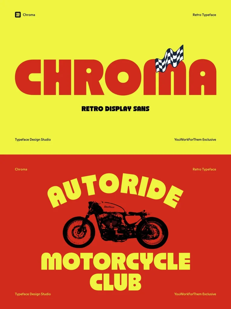
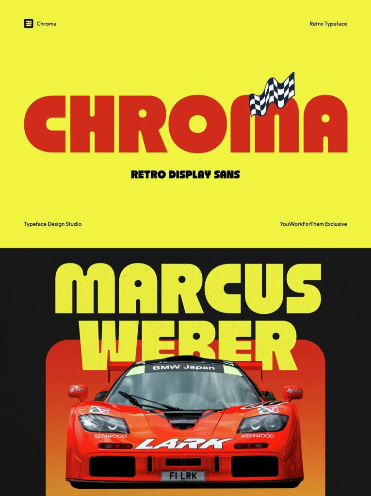
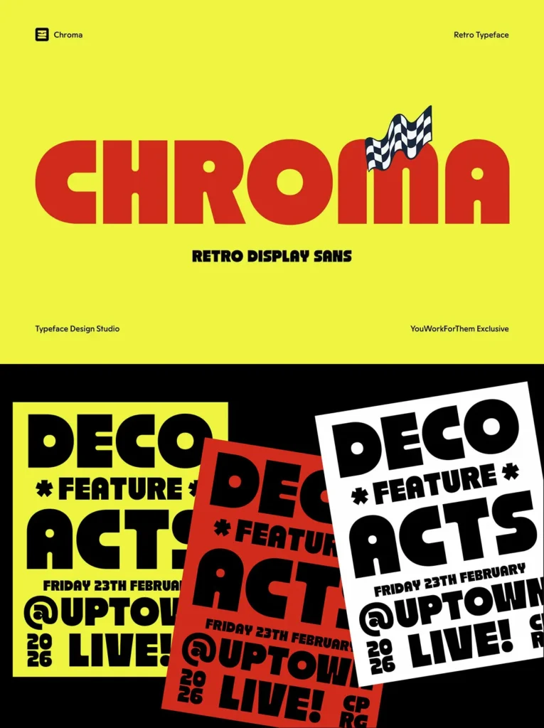
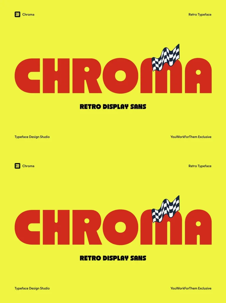
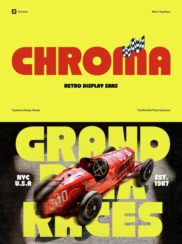
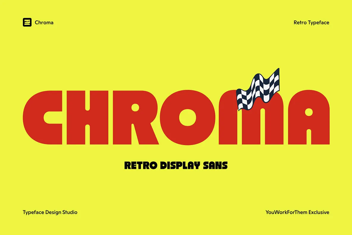
Chroma is a heavy retro display sans exclusive to YouWorkForThem, designed by Typeface Design Studio. It draws from Bauhaus geometry and the raw visual energy of late-1990s rave and techno flyer design, the kind of type that defined foundries like Büro Destruct. Structured enough for modern digital work and bold enough to dominate any screen, Chroma sits at the intersection of period-specific design and practical contemporary use.
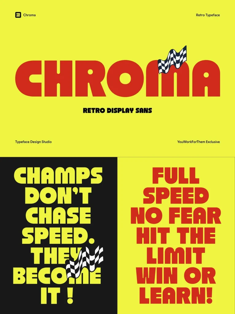
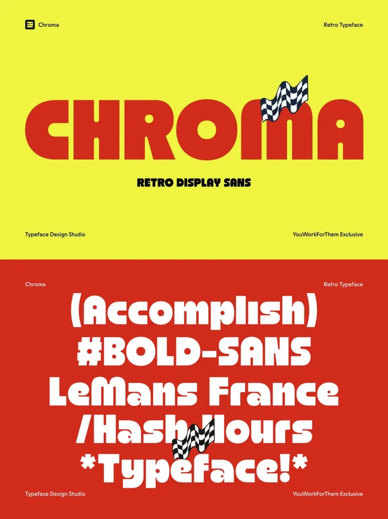
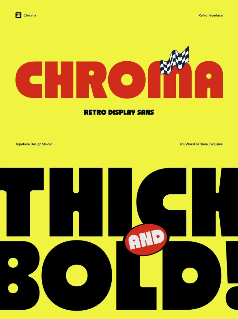
The uppercase is tightly compressed and massively weighted, with circular counters and minimal negative space that push each character to its limit. The lowercase shifts register entirely, looser and more organic, with a rounded rhythm that reads fast and hits hard. Subtle ink trap detailing at key junctions gives the letterforms a print-informed precision that holds up at any display size. Both cases carry strong x-height and consistent weight, making the full character set reliable across a wide range of layouts.
Designed for Digital
Chroma was built with digital-first use in mind. It performs across social media artwork, music event posters, video reels, title cards, and any context where a short headline needs immediate impact. The weight and contrast work equally well in all-caps settings and sentence case, making it more versatile than its aggressive personality might suggest. Multilingual support covers Latin extended characters, numerals, punctuation, and a range of currency symbols, making it a strong choice for international projects.
OpenType Features
241 Glyphs
Fractions
Ordinals
Standard Ligatures
Stylistic Alternates
Stylistic Set 01
Stylistic Set 02
Superscript
The stylistic sets provide alternate letterform options, useful when a project calls for a slightly different tone without switching typefaces entirely.