
Hypeline — Heavy Sans, Sharp Details
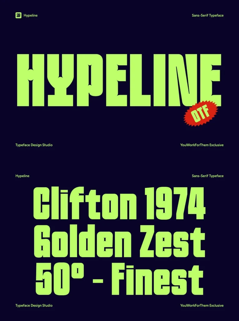
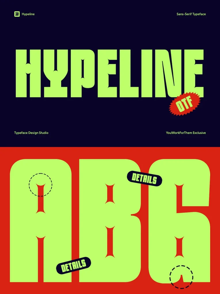
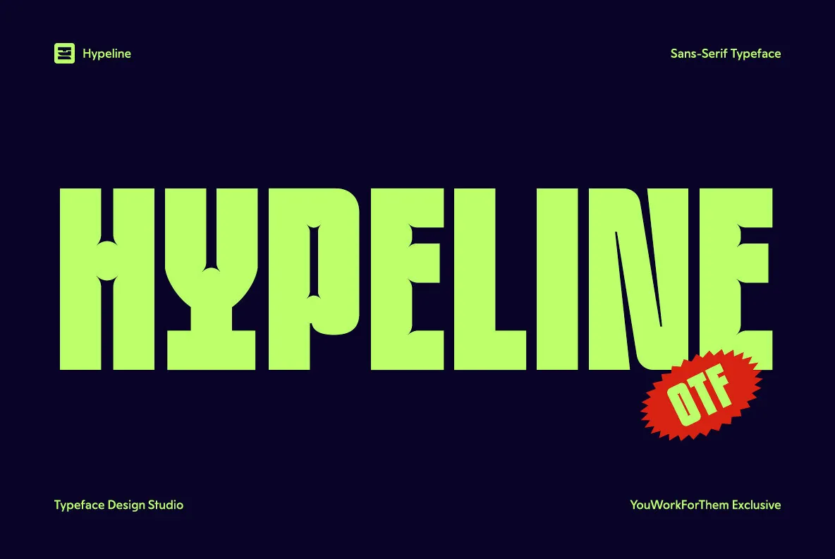
Hypeline is an ultra-bold sans-serif display typeface built around a single defining detail: ink trap notches cut into the joints of each letterform. At large sizes they read as a sharp, intentional design signature — precise cuts inside massive, rounded strokes. The contrast between the weight of the forms and the sharpness of the traps gives Hypeline a character no standard heavy sans carries. Designed by Typeface Design Studio, it is a YouWorkForThem exclusive.
Two Styles, Full Range
Regular and Slant cover the two directions most display work needs — straight authority and forward-leaning momentum. Full OpenType support across both styles, with language coverage spanning Basic Latin through extended Western European character sets.
Includes:
442 glyphs
2 styles: Regular, Slant
Extended Latin, Western European, accented characters
Fractions, standard ligatures, circled figures
Arrows and broad symbol set
Full OpenType feature support
Built for High-Impact Work
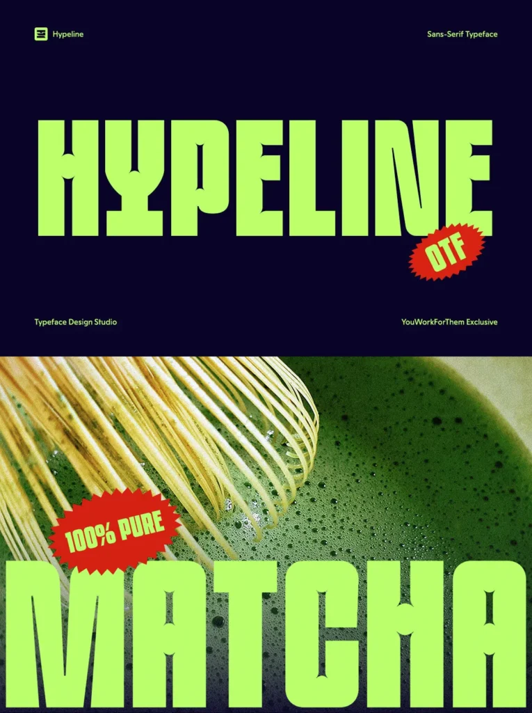
Hypeline holds the frame at any size. It works across YouTube thumbnail headlines, Instagram Reels title cards, poster campaigns, music festival lineups, sport brand identities, energy drink packaging, and streetwear apparel graphics.