
Monotune — A Monospaced Serif Built for the Grid Age
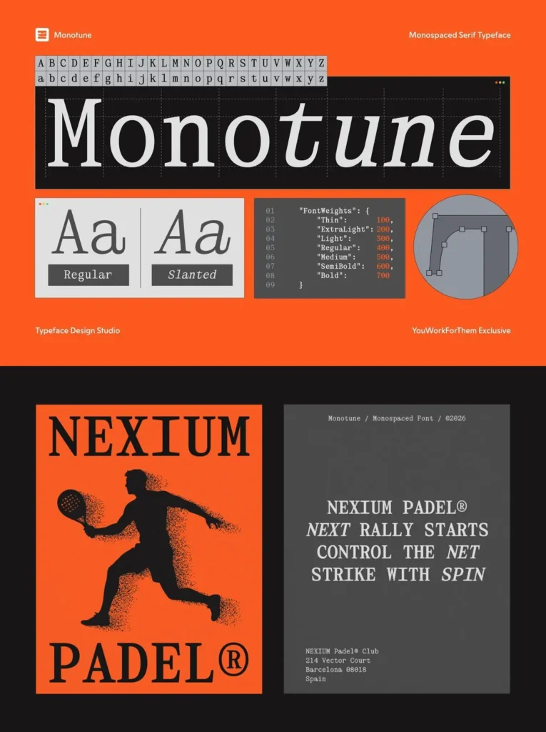
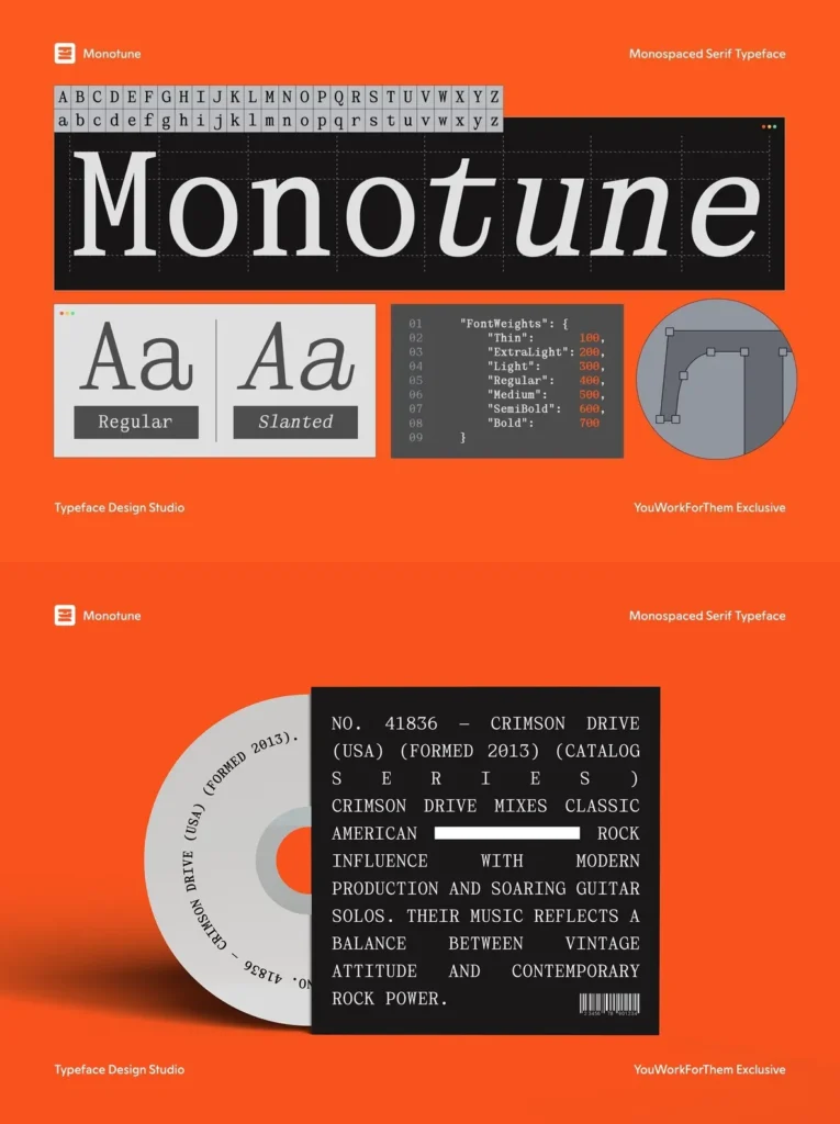
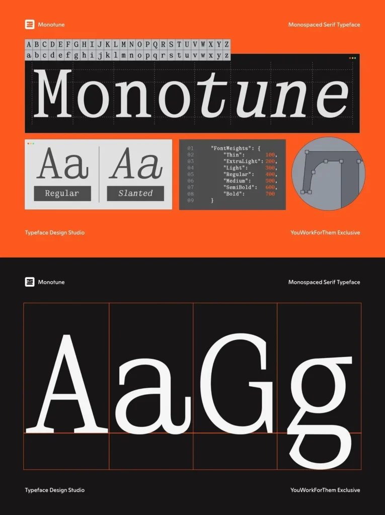
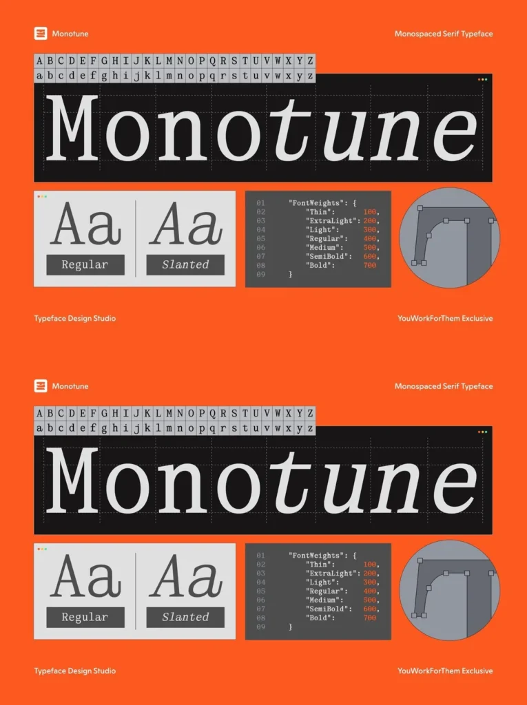
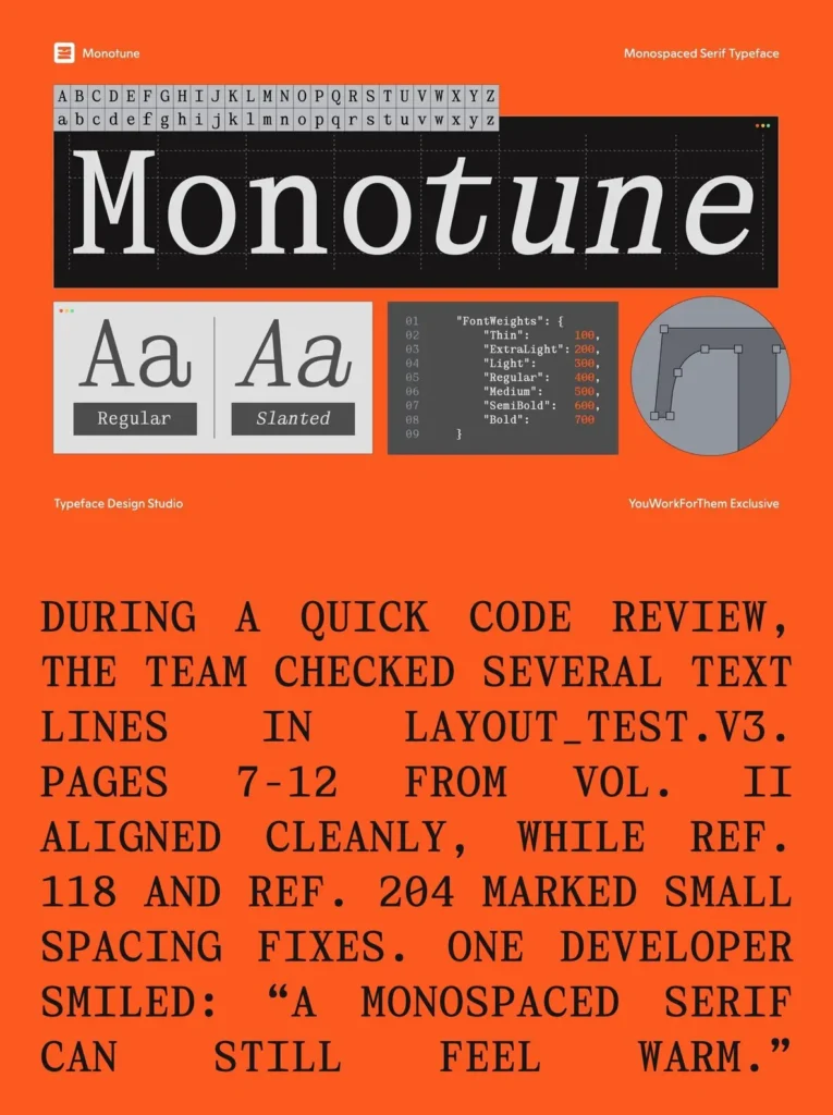
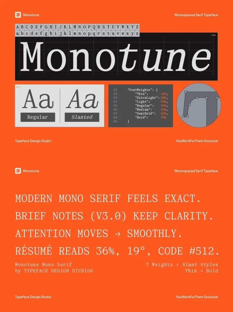
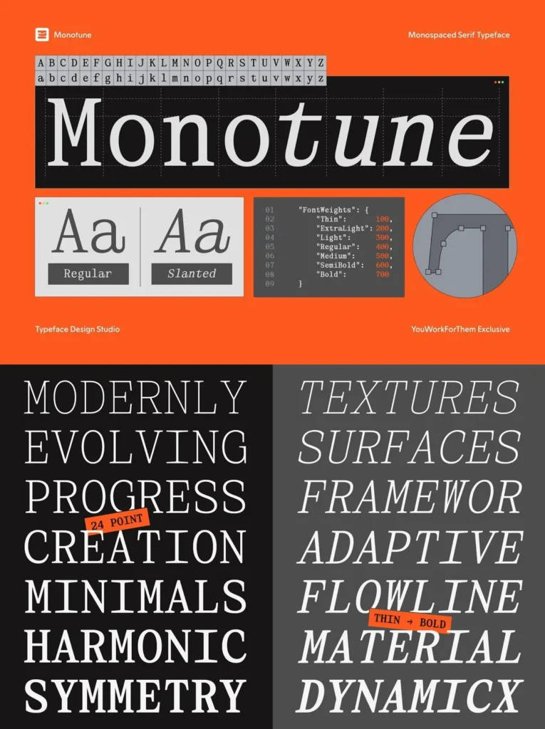
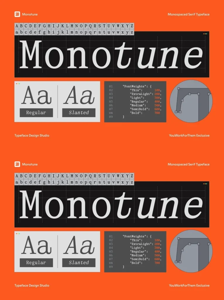
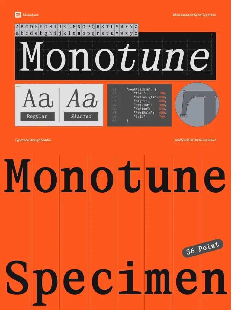
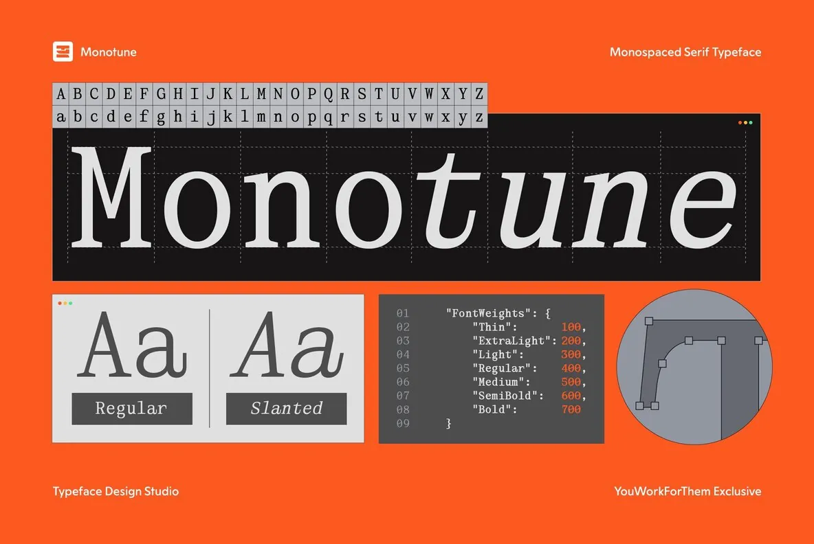
Monotune is a monospaced serif typeface from Typeface Design Studio, available exclusively at YouWorkForThem. Designed with seven weights from Thin to Bold, each paired with a matching slanted style, the family spans 14 total cuts. The structure is precise and systematic, but the serif details give it warmth that most monospaced designs intentionally avoid. That tension is the point. Monotune reads as technical without feeling cold, pulling from the visual language of 1980s computing without leaning into nostalgia for its own sake.
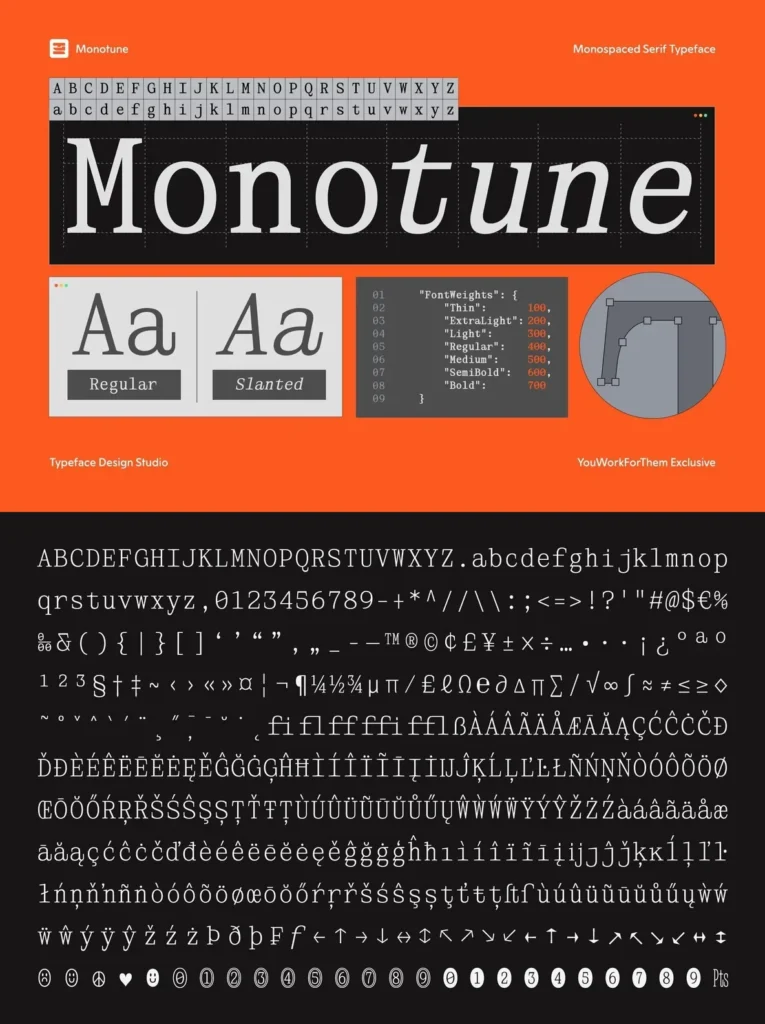
The weight range makes this more versatile than typical monospaced offerings. Lighter cuts work well at small sizes in UI contexts and comment labels. The heavier weights hold up in display settings, poster work, and social media UI mockups. Slanted styles add emphasis without requiring a separate italic, which keeps layout logic clean. The extended language support and OpenType feature set, including fractions, ordinals, standard ligatures, and alternates, give designers working across editorial and screen contexts the technical depth they need.
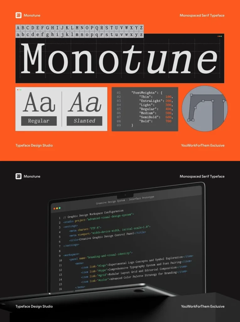
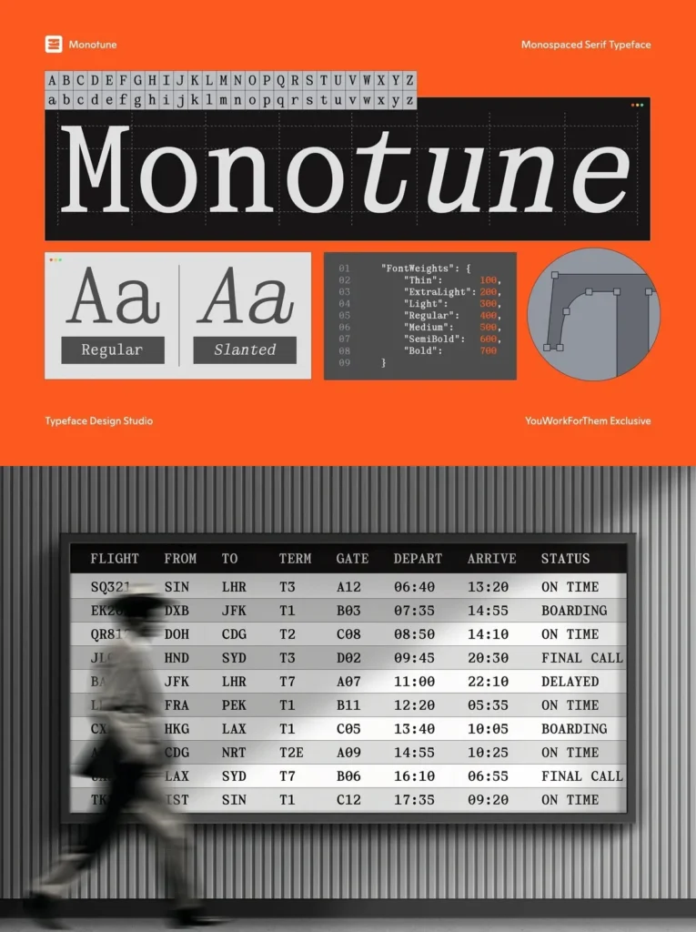
Monotune fits naturally in web design projects, subheader hierarchies, code documentation, app interface typography, developer tool branding, and retro-tech poster campaigns. It carries the functional logic of a proper monospace with enough typographic character to work beyond screen use. Offered at a flat desktop, web, mobile, and epub rate with no subscription required.
Technical Specifications
Styles:
Thin, Extra Light, Light, Regular, Medium, Semi Bold, Bold + matching Slanted variants (14 total)
Glyphs:
442
Languages:
Basic Latin, Western European, Euro, Catalan, Baltic, Turkish, Central European, Romanian, Pan African Latin, Dutch, Afrikaans, Basic Greek
OpenType Features:
Alternates, Case Sensitive Forms, Fractions, Historical Forms, Localized Forms, Ordinals, Standard Ligatures, Superscript
Exclusive to YouWorkForThem